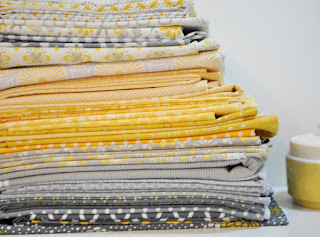
Here is my stack of fabrics for my next scrappy project. I have been accumulating/hoarding everything I can find in greys and yellows.

Then came along Baby Jane by Eric and Julie Comstock.

Then Kate Spain’s newest fabric, Sunnyside has some yummy pieces
in it so I had to add them to my pile.
in it so I had to add them to my pile.
The stack of fabrics continues to be fermenting so I had to get serious
and start weeding out the ones I was going to use.
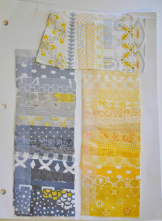
I like to cut swatches and make my own little inventory list
of fabrics as I collect them.
of fabrics as I collect them.
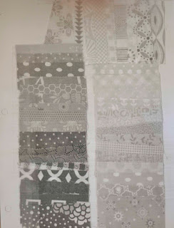
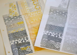
Then when it comes time to narrow down the pieces I look at them in grey scale. Nowadays this is much easier to do by just taking a picture of it on your phone and turning it to grey scale. I use to drag myself up to the copy shop and lay it on the copier to make a black and white copy.
If you have trouble with color this is a good exercise to build your color confidence.
I think color is scary for a lot of people, when that actually is the funniest part
with the fewest actual “rules.”
What is tough to get a grasp on is the difference of what
value and scale will do to your project.
with the fewest actual “rules.”
What is tough to get a grasp on is the difference of what
value and scale will do to your project.
By looking at the grey scale swatches you take all the color out of the equation. Sometimes we use a fabric just becasue we love the color, yet the scale or pattern ends up sticking out like a sore thumb.
I ask myself do I have the right mix of small, medium and large prints regardless of the color?
Looking at the fabrics in grey scale also helps determine if any of your fabric choices are way too dark or way to light.
I tend to gravitate to a certain scale of fabrics so I always have to make sure my choices all look the same. Try this out next time you are choosing fabrics. It is amazing how it helps narrow down your choices while adding visual interest to your fabrics choices.
-modalissa


I am so loving that beautiful stack of yellows and greys!! Can't wait to see what you make with it 😉
Those are beautiful. I saw a collection of grey/yellows at the LQS the other day – love at first sight. So did you eliminate any of your fabric choices? It would be nice to learn which ones and why you felt they should be eliminated.
The combination is so very fresh, modern, youthful, summer, I want to see what quilt you come up with!
What a great post! The samples of fabrics was beautiful to look at and very helpful information–Thanks Modalissa
New follower here through Bloglovin'… I seen the Moda post on facebook linking to your blog. I love it all… The name and the paintbrushes for the sidebar are picture perfect! And of course those grays and yellows look fabulous. Looking forward to seeing your next masterpiece.
Lorna @ http://sewfreshquilts.blogspot.com
What a fun journey you are having.
oh I love this combo….so what are you making?????
Kathie